Bringing a trusted brand to property management — extending a legacy identity into a modern, professional design system. The work spanned brand guidelines, digital touchpoints, and collateral designed to communicate stability and expertise to both homeowners and investors.
RockBridge came in with an established reputation — years of trust built with homeowners and investors — and a brand that actively worked against them. Their visual identity made them look smaller and less credible than they were. In a market where first impressions are everything and clients are evaluating multiple firms, they were losing the room before the conversation started.
"Before Finrez, our brand didn't reflect our service level."
— RockBridge CEOThe goal wasn't to reinvent RockBridge — it was to make the brand reflect what they already were: experienced, precise, and trustworthy at scale.
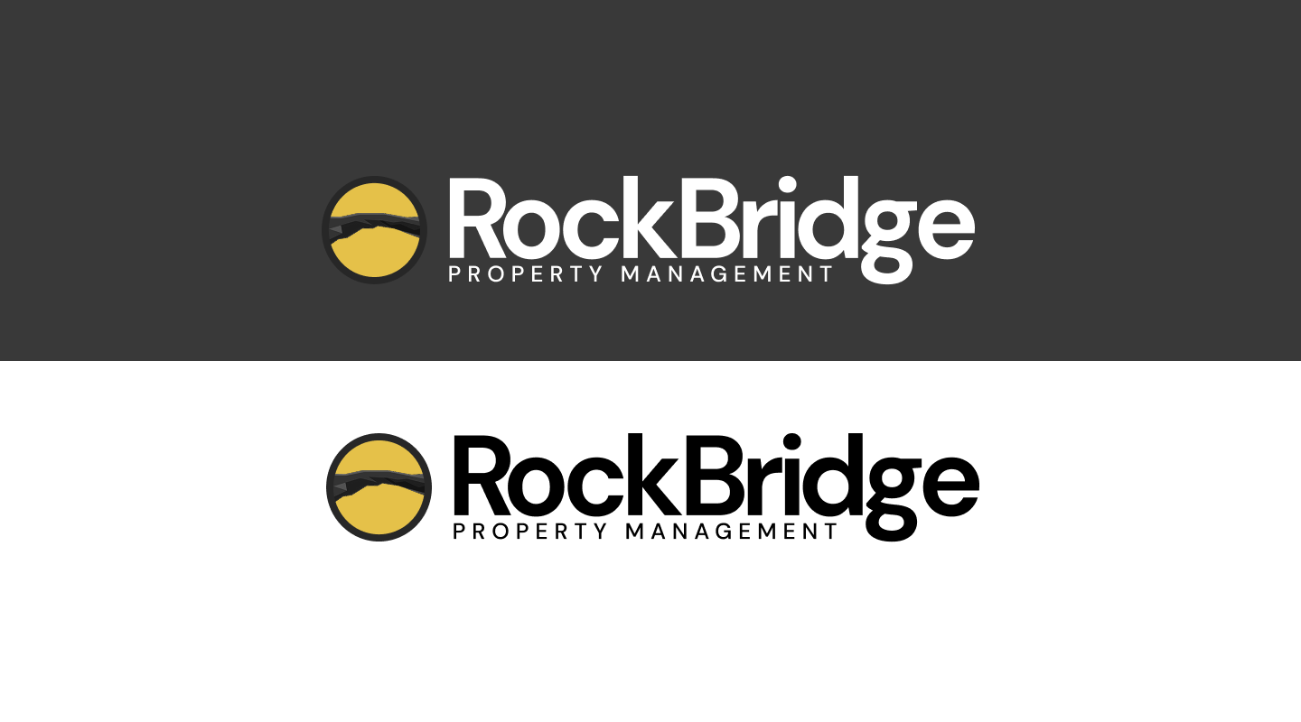
We extended the existing identity rather than replacing it. The equity built into the RockBridge name was real — clients knew it, referred it, trusted it. A complete rebrand would have erased that. Instead, we modernized the visual language: refined the mark, built a proper type system, and created a color palette that reads as established and premium rather than generic.
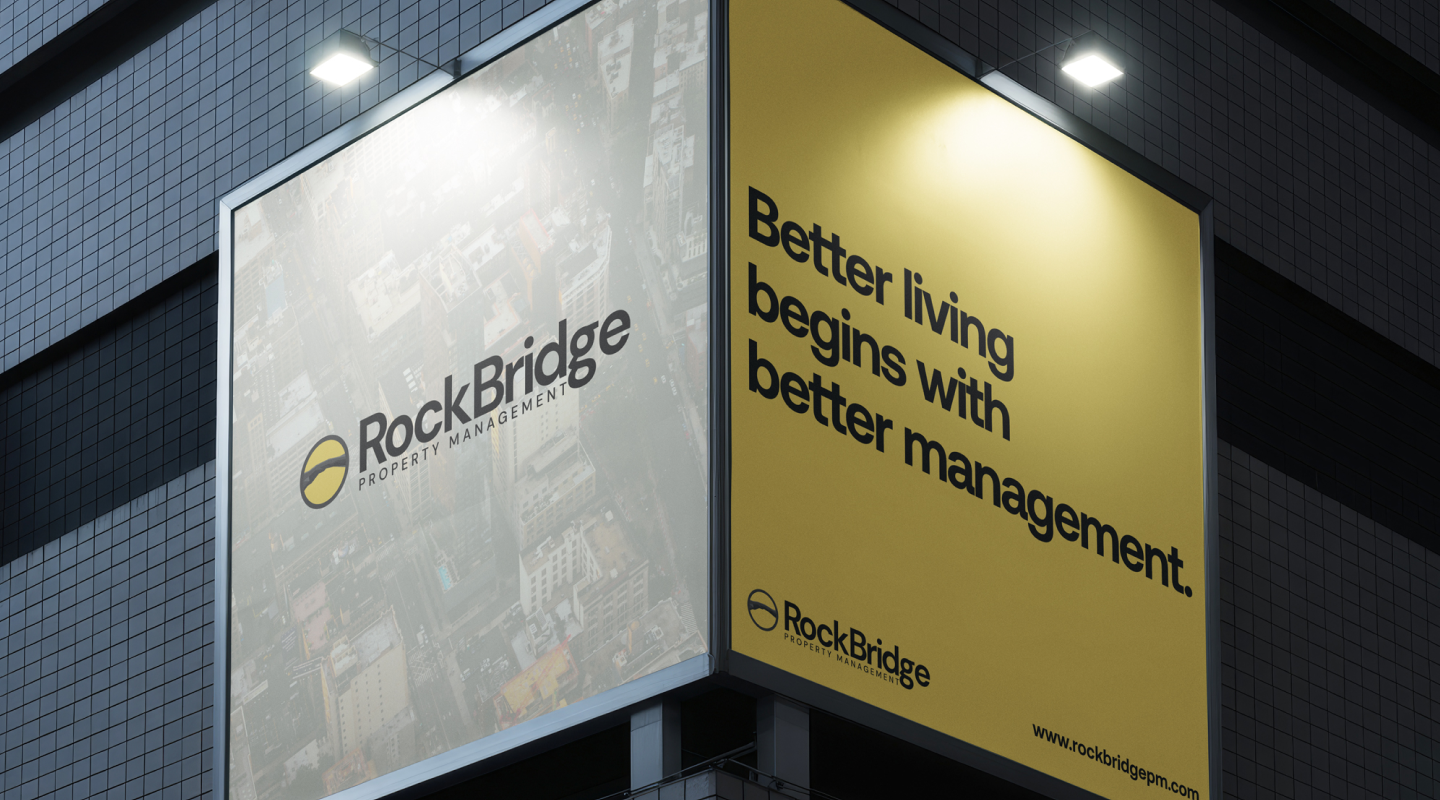
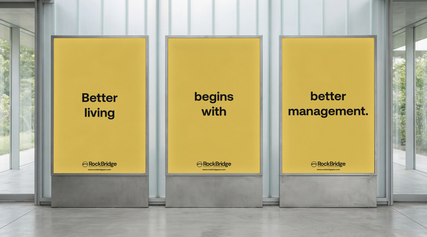
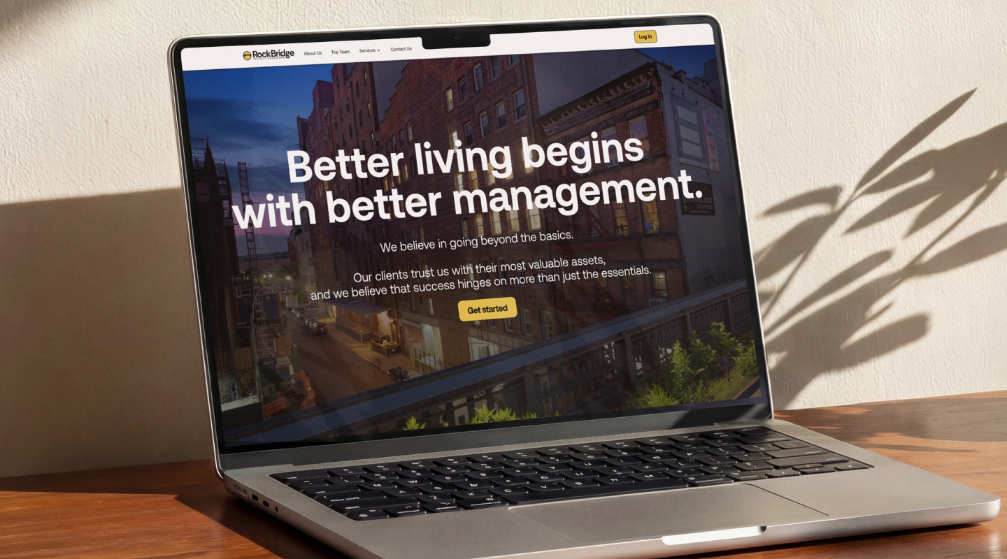
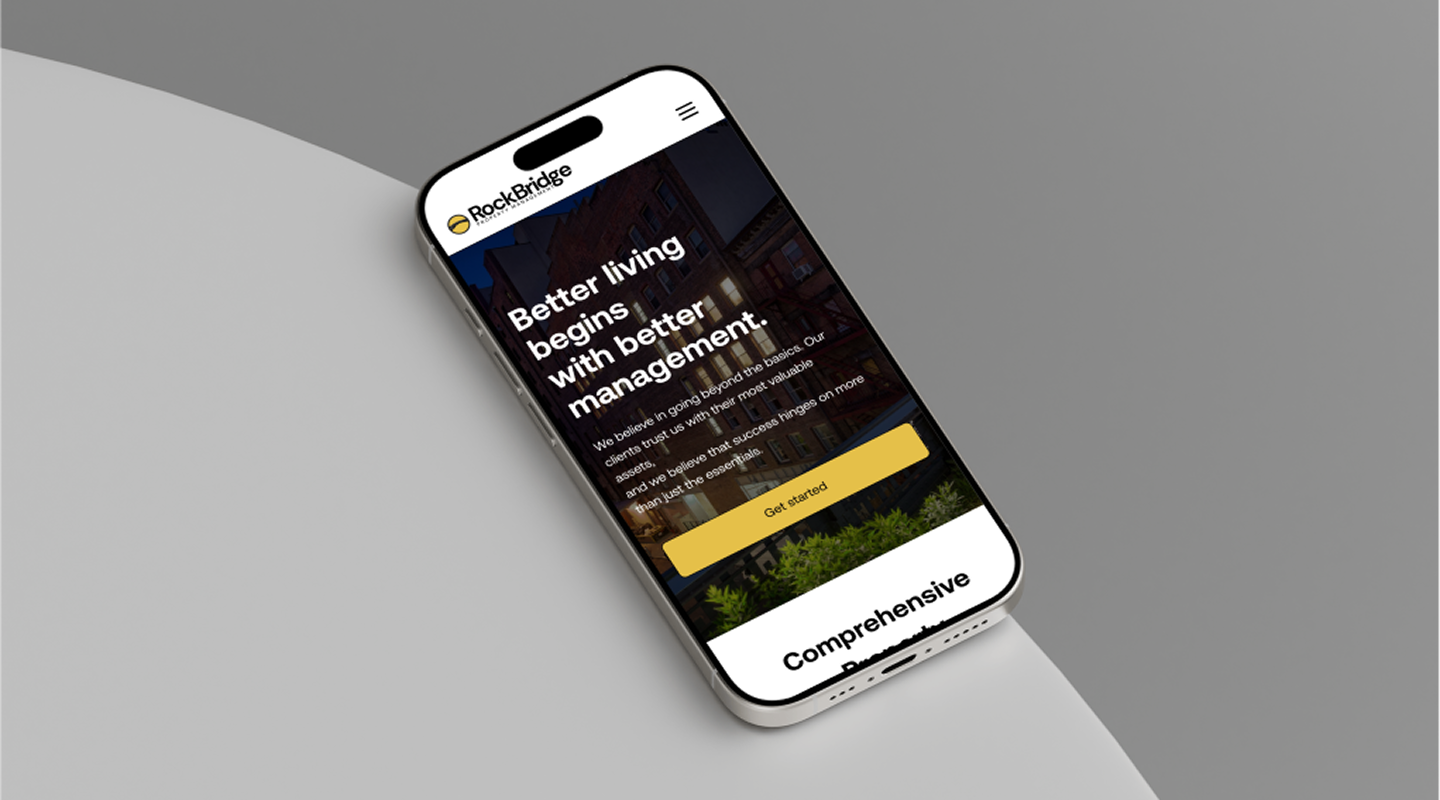
The digital touchpoints were designed to work as a system — not individual pages, but a cohesive visual language that could run from a website to a proposal document to a yard sign without losing coherence. Every decision was pressure-tested against the core brief: does this make them look like the firm they actually are?

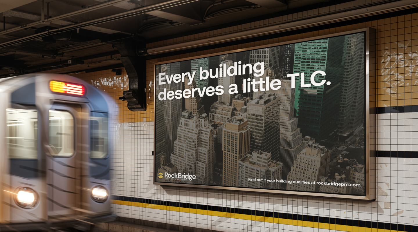
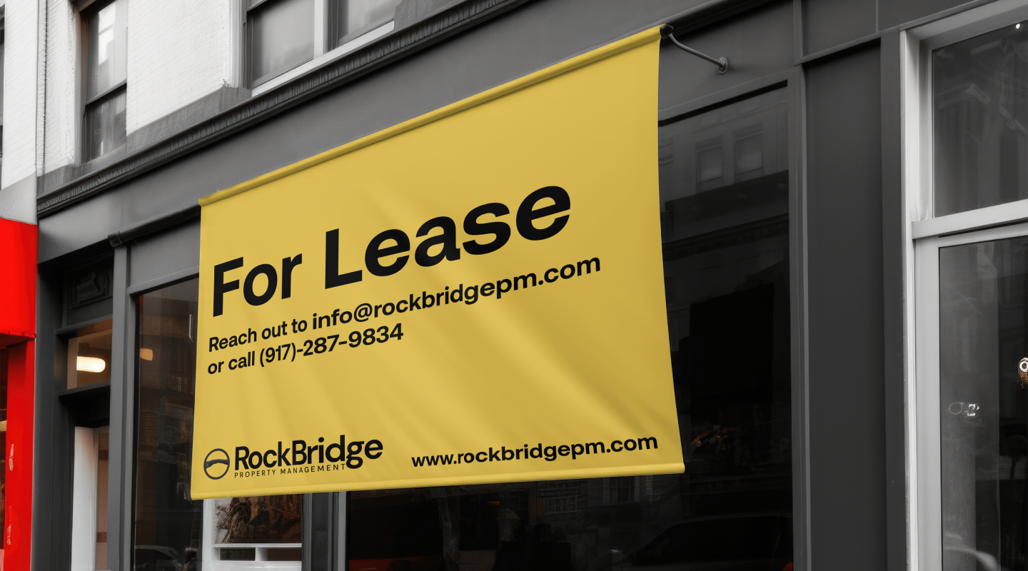
The brand system was built to span every surface RockBridge touches — digital, print, and environmental. Web design, investor materials, property signage, and collateral templates all draw from the same visual logic, so the brand holds together whether a prospective client finds them online or picks up a brochure at an open house.
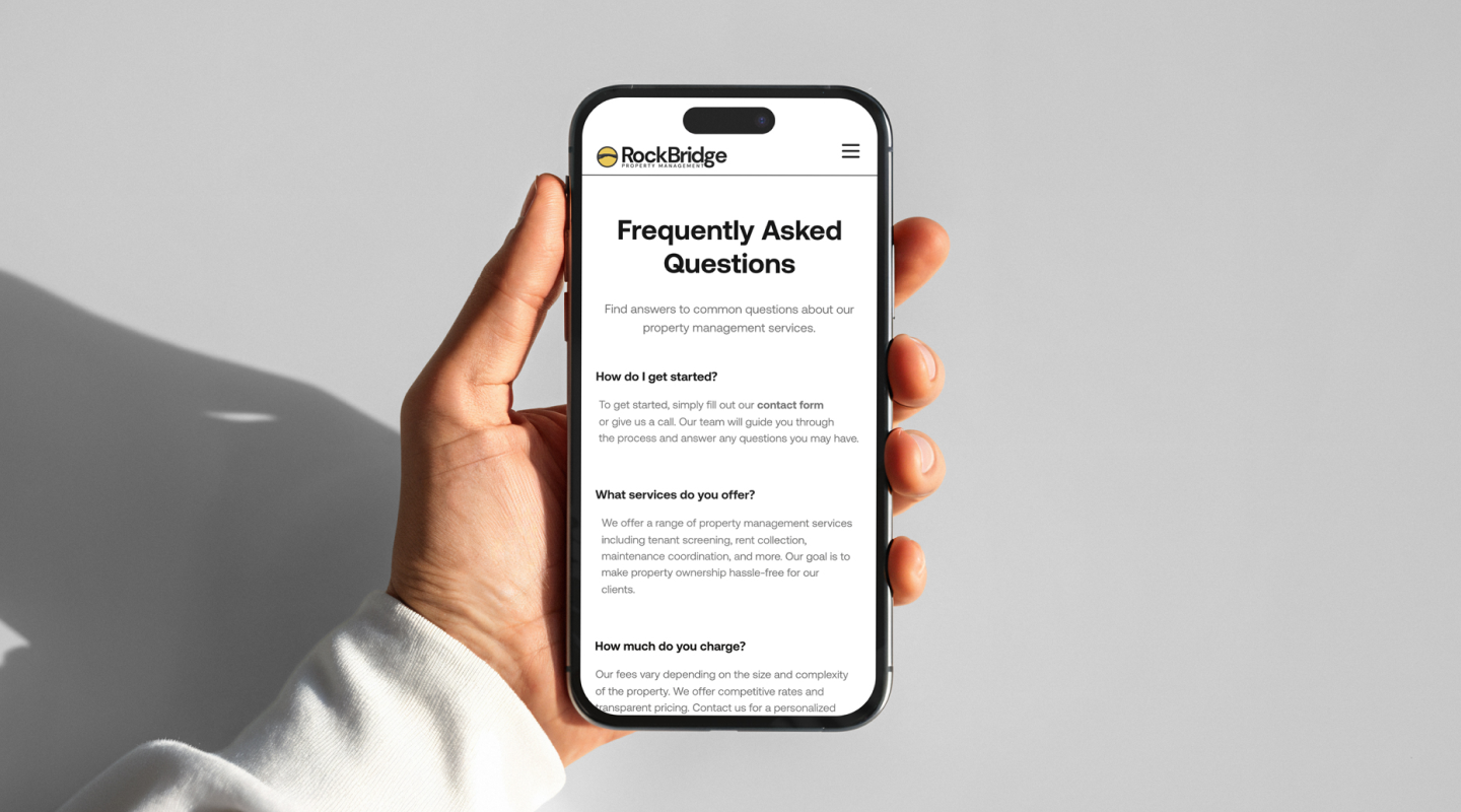
The web presence was designed to match the service level: clean information hierarchy, deliberate pacing, and a visual language that communicates expertise before a single word is read. No stock imagery, no generic layouts — just a site that earns trust immediately.
Brand guidelines, a refreshed mark, a full digital design system, and collateral templates were delivered production-ready. The brand now reads at the level their service has always operated at — giving the team something they can hand to any vendor or use in any pitch without needing to explain or apologize for it.